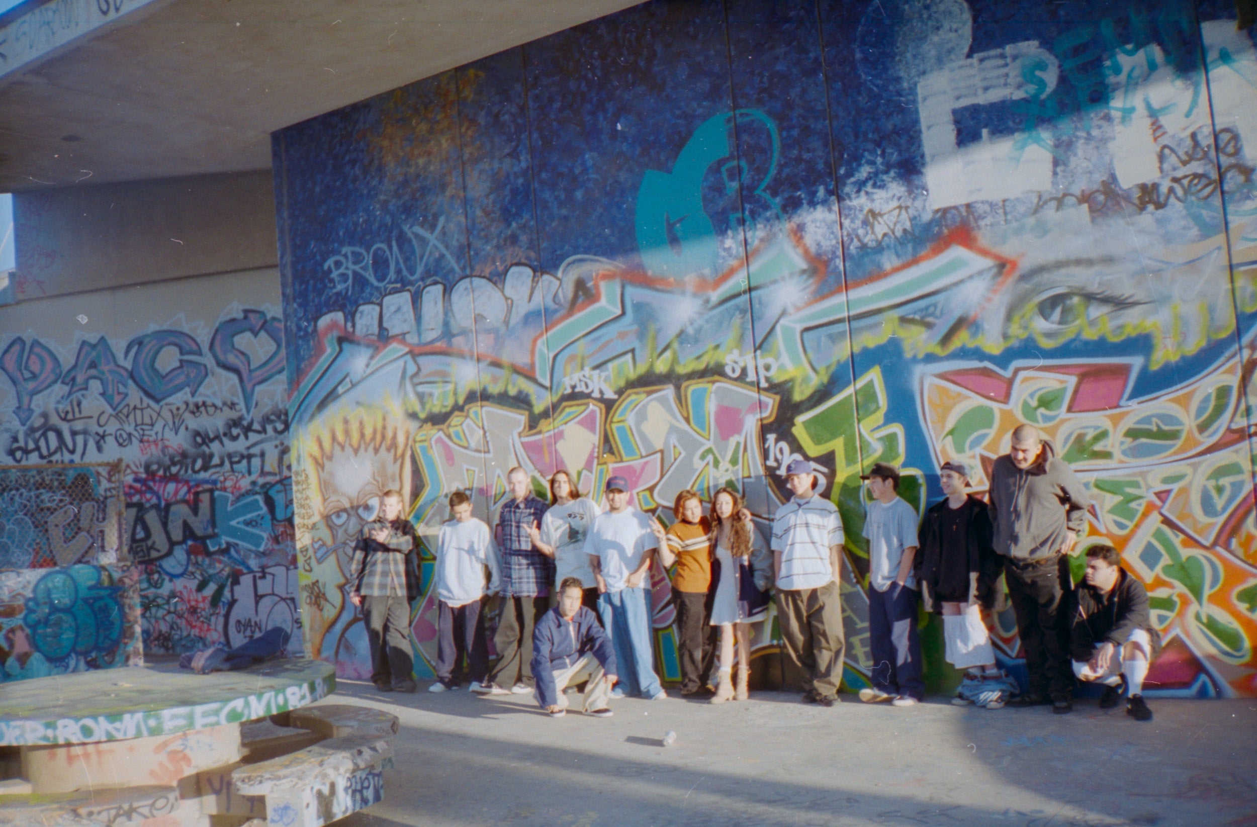
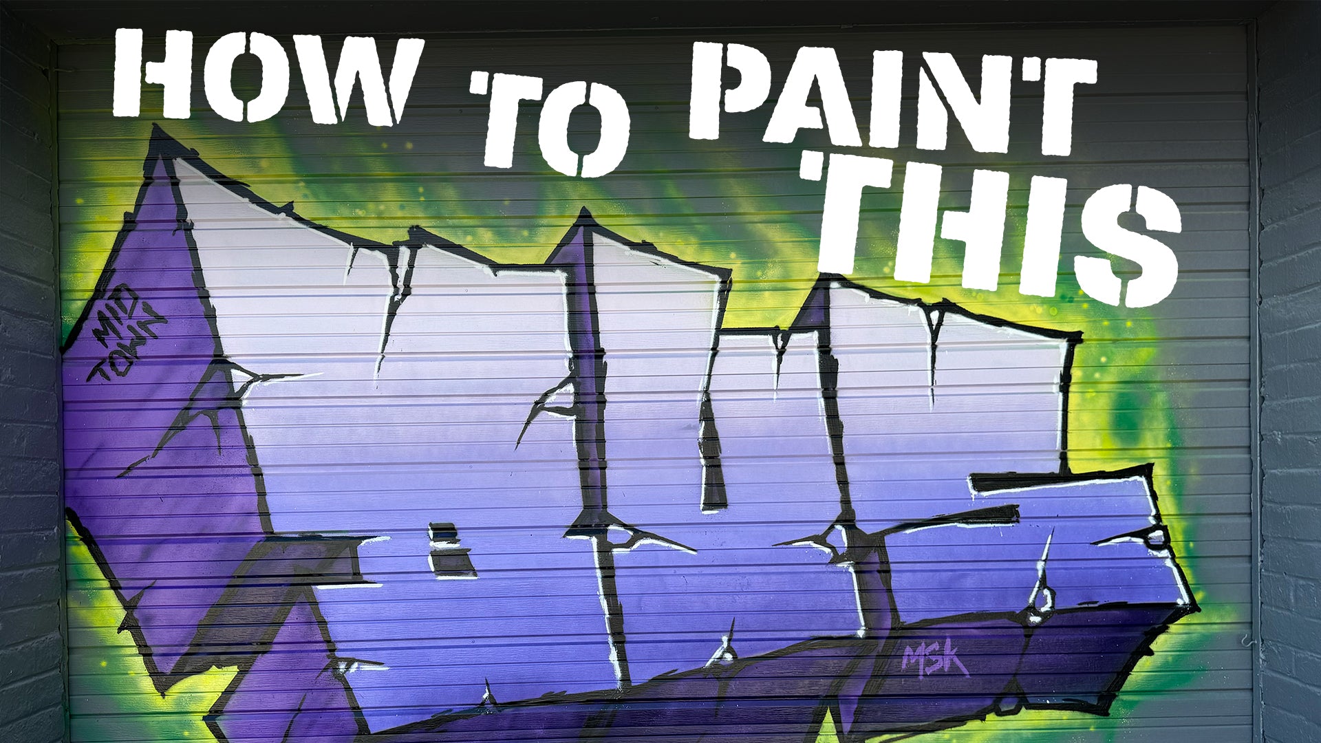
This is a full breakdown of how to paint this graffiti piece from start to finish. We cover all of the techniques from start to finish from sketching out the letters, filling in, background, gradient fade, 3Ds, etc. in this 12 minute video.
TRANSCRIPT
Alright, so I'm gonna break down this whole piece, go over all the tools and the techniques I used to make it. So maybe you can apply some of that to your own stuff. So of course, it starts with the sketch for this specific style. I start with a cube, and that'll give me sort of the foundation for where all of my letters go. So I'll divide the cube up into three sections, because I'm doing three letters. Disregard the line on the end. I made the cube too small. So that's why there's, there's four sections. It's it'll come together later, once the cube is divided up, then I'll go in and start roughing out the letters, and I'll use those little sections to guide me and make sure my stuff stays proportional. And once my sketch is all done, I like to go back over with a different color and redo the sketch. This part is pretty much unnecessary, but I find, I find I do a better piece when I do this, generally, because it helps me really establish the actual outline and gets, kind of pushes all the sort of scratchy stuff to the back.
So then once the sketch is all done. Then obviously I go into the fill. Oh, by the way, I use the pocket cap to do the sketch. I really like that cap. It's just like a basic stock cap, but it the thing about the line quality of the pocket cap is that you don't really have to worry too much about the distance. So when I'm sketching, I'm going really loose. And, you know, the distance between the wall changes quite a bit when you're just kind of like roughing stuff out, and the pocket cap maintains a somewhat consistent line thickness. That's why I like using it for that. So now that the sketch is all done, I'm going to go into the the fill. So I'm going to fill the surface first, because I'm going to do a gradient on the front. So I'll, I mean, not the surface, but, you know, the front of the letters. And for this, I'm gonna use the very air, very ater cap, and this is the first time I ever actually used it in a piece. I've tested it before, but I never actually put it into full practice. And actually, I think this is gonna be my go to cap for filling in pieces. And the reason is, when it's opened all the way up the very inner cap, if you're not familiar, it has a little dial on the side. So it's a chisel cap that you can turn up or down the pressure with this little dial.
It kind of seems like a gimmick, but it's actually pretty cool. So wide open, you can see it fills in pretty efficiently and and quickly, I find it fills in faster than the circular spray pattern caps. The cool thing is, a lot of times when you have more precise areas that you need to fill in, and you don't really want to blast a bunch of paint, you can turn the dial all the way down and really get into these little fine areas, then switch it back to the wider pressure to fill in the bigger areas. Again, I really like that flexibility without having to change the cap. So as you can see, I blocked in the colors, and then I'm just gonna blend them together. Afterwards, I find that's the easiest way. I don't know if other people do it differently. So then I'm gonna rotate then the nozzle, so that it is actually spraying sideways, because I like to hold the cannon at a horizontally to spray upward, and it gets the start of the blend done that way. But that's never enough to Well, I mean, I get less of it. Was a really small piece.
You might be able to just get away with that upward spray. But since this is a bigger piece, and also it's on a ridge surface, so you can see that the gradient didn't really come together, and you have to, you have to just mist on it's, it's kind of hard to explain. Hopefully the video shows it, but you just missed on color, over over top. And I don't know, having trouble explaining it, but you just sort of missed on the color. And then I'll go, I'll, I'll kind of miss both colors to just keep, kind of putting on layers and keep blending it. And then before I finish, I go to the bottom and mist on some of the dark colors from the 3d just to get a little bit more depth in the color fade. So once the color fade on the surfaces of the on the surface of the letters, is all done, then I'm gonna go in and start filling in all the three Ds. So I do the left side first. And for this particular style, I usually do two colors on the three Ds, and then I'll blend those two colors together afterwards, and I'll show you that later on in the video. Unfortunately, the camera overheated, so I didn't really get a chance to shoot the footage of blocking out the bottom of the three Ds, which was the darker color, but it's pretty much what you would expect. So then I'm gonna go into the background for this. I meant to do sort of like a green kind of fire. It didn't come out exactly how I wanted. I haven't done this technique for quite a while, so I'll probably revisit it and have it in another video. So
if you're interested in that, just keep an eye out. And on that note, this is the first of these kind of videos. So if you do like this kind of content, I'm gonna be making more of this. So be sure to subscribe if you just caught this randomly. So with the fire, the way that it works, the way that I do it is, I'll block in the dark color first around the background. So this, this is for a fire back. Around. There's also ways to do it, as your letters are on fire. And maybe I'll do some of that stuff, but I'm gonna block in the dark color green all around the letters, and then after that. So this will be done with three different color greens. So it's like a dark a medium and a light, sort of, I mean, the medium is kind of light in this case. So now that I got all the darks in, I'm starting to mist in some of the light colors, as you know, just sort of kind of, you really want to lay this on in, in sort of like light mists, you know, so that you don't commit to a big block. But even if you do, like, mess up, and you you put too much paint down, you can always come back in with the other color.
And I do that throughout the process, I'll, I'll sort of add in some of the lighter green, and then I maybe won't like the shape of it, so I'll go over it with the dark green and just sort of try to shape it. One thing that I don't like about how this turned out is I didn't do a very good job at creating the direction of the flames. I really want them to, wanted them to go back towards the left. But they all kind of ended up going all these weird ways. But once all that's in there, then I went in with the lightest color. And sort of the lightest color kind of goes in the middle, and then also, kind of It borders the edge of the piece. So instead of doing, depending on where you're from, the Border Force Field shell, I don't know there's so many names for it that sort of functions as as that part. So I'm gonna do that first, and then once I do the outline, I'm not gonna add the extra border. In this case, sometimes I do it that way, but and so to get the really small dots, I was having trouble just pushing the cap a tiny bit, by the way. I forgot to say what cap it was for the flames. I did all of it with the pocket cap. I'm sure other caps would work very well for it, but that's just how I always do it. So anyway, I was having trouble getting the dots.
I wanted really tiny dots. So the technique, I don't remember who showed this to me, but you can just hold the can and then tap, tap the tip with another can, and just get these little, tiny dots. So then once that background was pretty much how I wanted it. I went back in with the needle cap, because if you hold the needle cap at a distance and kind of mist on, you'll get these little cool kind of speckles. And I thought that might add a little bit of texture to the flames. So now that the piece is filled in, the backgrounds in the 3d colors are blocked in. Now I'm going to go in and add some texture to the three Ds. And I do a lot of different ways of doing this. In retrospect, I kind of wish I added some cross hatching with the outline color, but I super hot in Vegas, and I just was done. So I didn't end up doing that. But the textures, the way that I texture the 3d for this, this style and a couple other things that I do is I'll just sort of mist on the colors. So in this 3d add two different shades of purple. So for the left facing 3d I'll mist in some of the dark, and then I'll come back in with the with the lighter color, and sort of mist over top of it.
You kind of make these layers. And so if you add a little bit too much of the dark, you can pull it back with the light. You just kind of go over it a little bit here and there, until it gets the way you want it. And I did the same thing for the bottom ones. It's just the opposite. So it's the bottom ones use the darker purple. So I went in and missed it on some different textures on the dark with the light. And then I used the dark to kind of pull back some of the stuff that I felt was a little too strong. So, so now we're almost done. I'm gonna do the outline. And for the outline, I used the pocket cap and and the needle cap. So I first rough, well, not rough, but I kind of do the base outline with the pocket cap, and then I'll often leave a little section in areas where I want to put in some cracks. And so I'll go through the whole piece and kind of do, I missed a spot on the bottom, so I ended up filling that in later, which I don't know if you'll see that, but I'll get the outline in, and I'll start adding some of the little for this particular style, I like sort of a crusty outline. And and this technique, I find it's fun to do because it takes a lot of pressure off.
You just do these little, short lines. You don't have to worry about these big, long lines and stuff like that. One thing I will say about that is I sort of started to rely on doing these kind of crusty outlines. So I had to sort of force myself to do pieces with the long, clean lines, just to make sure I kind of kept my can control up, because this technique is, I find this technique a lot easier to do than those, those long, hard, precise lines. So I'll sort of rough in the outline and kind of thicken it up in places where I want it thicker and add some little chunks and bits and pieces so that it kind of looks like a looks like the outlines kind of chewed up or mangled or something. And then I'll, I'll draw in the cracks in the places that I left open for cracks. And then once I've kind of roughed out the outline with my pocket cap, then I'll go back in with the needle caps, and go in and sort of like sharpen up edge. Is and put sharper points on my cracks and things like that. If you look at it real close, it's it's pretty crusty, but you can get these really sharp points with the needle cap, which is something I really like. And you don't have to do, you don't have to do any cutbacks or anything. So the overall look is gonna have sort of a kind of a crusty, kind of grimy look to it anyway. So I find the needle cap to be perfect for that. So now that the outline is all done, I'm gonna go in and add highlights.
And for the highlights, I just exclusively use the needle cap. And you can see that they're really sloppy highlights, but that's totally intentional. It's kind of what the look that I wanted it to have. So what I like about it is it just sort of frees you up. It doesn't even matter if they touch the outline. Sometimes they do, sometimes they don't. It's just sort of like, you know, it's just a free form, kind of loose way to paint. And I find it, I find it fun. I know a lot of a lot of people probably hate on it. They like the cleaner stuff, and I do do the cleaner stuff, but in with this style, I just think it lends itself to having sort of a grimy look to it. So if you stayed to the end, I hope you liked it, and this is the first one, like I said, so I'm gonna keep trying to push the limits and get better at this stuff. So keep an eye out. Subscribe, do all that stuff. Appreciate you.