A few days back I did a video with a sloppy needle-cap fill, and it left me with ideas I wanted to try. This is the follow-up. Two things I'm testing here: adding a little more complexity to otherwise simple letters, and running a second color under the fill so it shows through the crisscrossed needle-cap work. I don't know exactly how it'll land, but that's the point of trying it on camera.
If you want to check out the previous video, you can find it here:
https://machinestudio.com/blogs/graffiti-school/outline-first-needle-cap-fill
The Plan
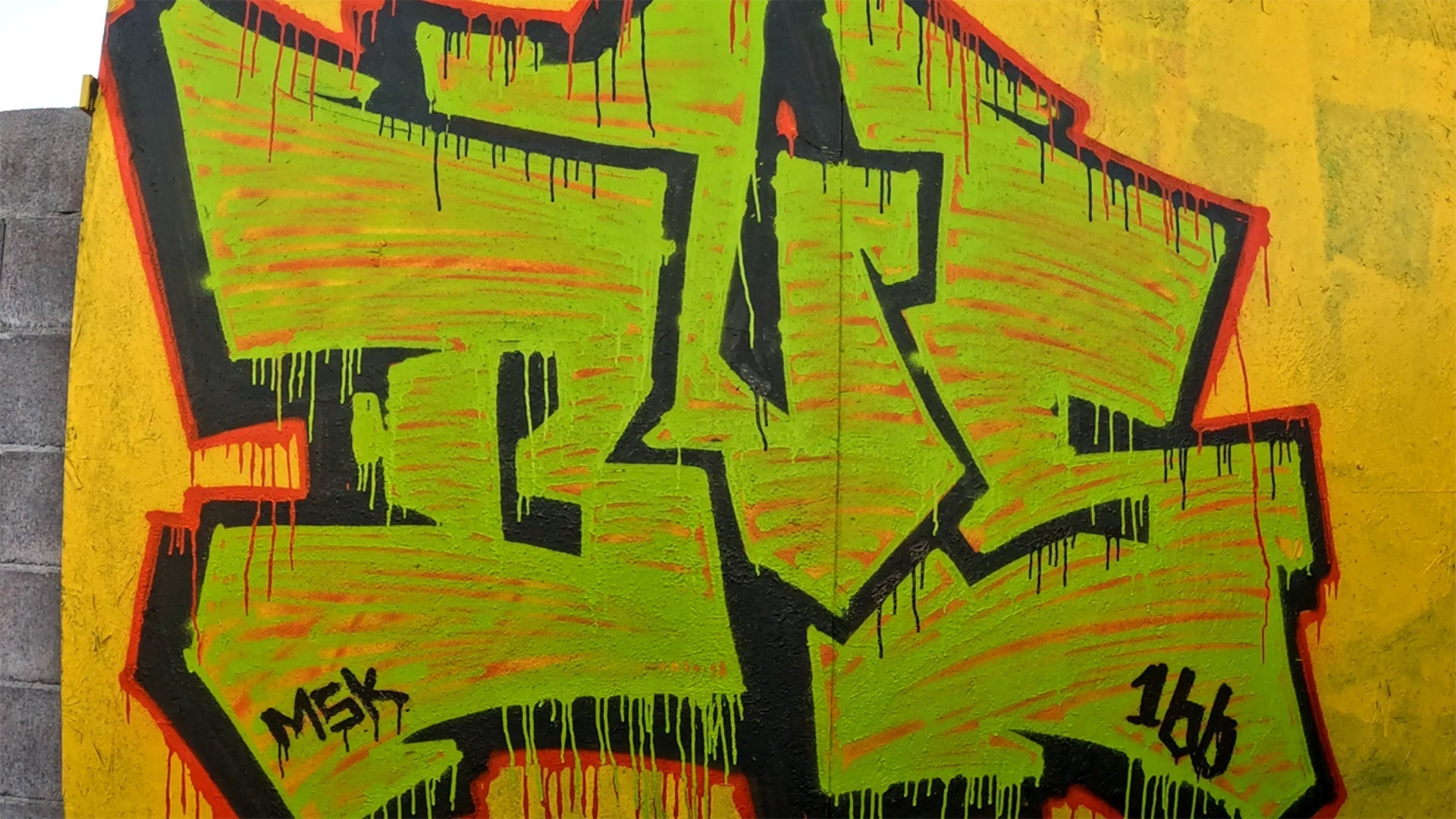
Simple letters again, but with a bit more detail worked into them; small additions, nothing heavy. The main experiment is color: lay down a base color first, loosely, with the needle cap, then fill over it with a second color. Because the needle-cap fill is open and crisscrossed rather than solid, the base color underneath stays partially visible through the top layer. The question is whether that reads as depth or just as noise.
Building Up the Letters
Start with simple letters and add small details to give them a little more complexity. Keep the additions restrained; the goal is to make the shapes slightly more interesting without overcomplicating them, since the fill is going to be doing a lot of the visual work.
Laying the Base Color
Before the main fill, put down an orange base loosely with the needle cap. This layer isn't meant to be clean or complete; it just needs to exist underneath. When the second color goes over it, the orange shows through the gaps in the crisscrossed fill. This is the same outline-first, fill-second logic from the previous video, applied to color instead of outline: you're putting something down early specifically so a later layer interacts with it.
Adding the Second Color
The needle cap sharpens up the details, and a new can changes the equation mid-fill; a fresh can runs at higher pressure, so you have to adjust your distance and hand speed to match the coverage you already laid down or the fill goes uneven. For the finish, the green goes over the top of the orange, then more green drips along the border to tie it together.
A Note on Wabi-Sabi
I've talked about this before: wabi-sabi, the idea that nothing is finished, nothing is perfect, and nothing lasts. I keep trying to work that into graff, but I still catch myself being rigid about how I add grime and imperfection. If you're adding the imperfection too intentionally, are you even following the philosophy? I don't have a clean answer. On this one I tried to just not think about it and let it happen.
How It Turned Out
I can see this working, though I'm not sure I fully pulled it off this time. I like it, but it's going on the practice pile. The yellow buff was alright; a darker buff probably would have made it pop more. Worth trying again with that change.
---
Full Transcript
The video I did a couple days back had a sloppy needle-cap fill, and it left me some ideas I wanted to try. So I'm doing that now. First, I'm going to do simple letters but add a little complexity to them, just to see how that plays out. Then I'm going to add a second color on the fill, so in the crisscrossed fill you'll have another color coming through. Curious what that'll look like.
I'm just going to add small details to these letters. Still pretty simple, nothing too crazy, just little doodads. Then I was thinking, if I add some orange loosely, this is with the needle cap still, even just a little weird stuff, so that when it gets filled over with the other color you'll see it underneath. See how it goes.
I've talked about this before, but there's this concept, wabi-sabi, that nothing is finished, nothing is perfect, and nothing lasts. I've tried to incorporate that into graff, but I still find myself being really rigid with how I add. If you're intentionally adding grime too intentionally, is it really following that philosophy? I don't really know. So I'm trying to just not think about it and see what happens.
In the previous video I did the outline and then the fill. So even though I've done partial fill so far, I'm going to do something similar. Stuff like this. I'm hoping the needle cap will come in and sharpen these parts up. It still looks like a mess, but I'm thinking once the fill happens, that's when it'll come together. That's the hope. You never know how these things are going to go.
This is a new can, so the pressure's a lot higher. Trying to match it to what we already have; it's really coming out of there. I still don't quite know what this is going to be.
Okay, so now the idea is to do the drips on the border. I want the green to go over the top of the orange. Now add more green drips.
I could see this working. I don't know if I pulled this one off. I kind of like it, but I'm definitely going to practice this more. I like the yellow buff; I think a darker buff would have made it pop more. But I'm going to keep trying it.