
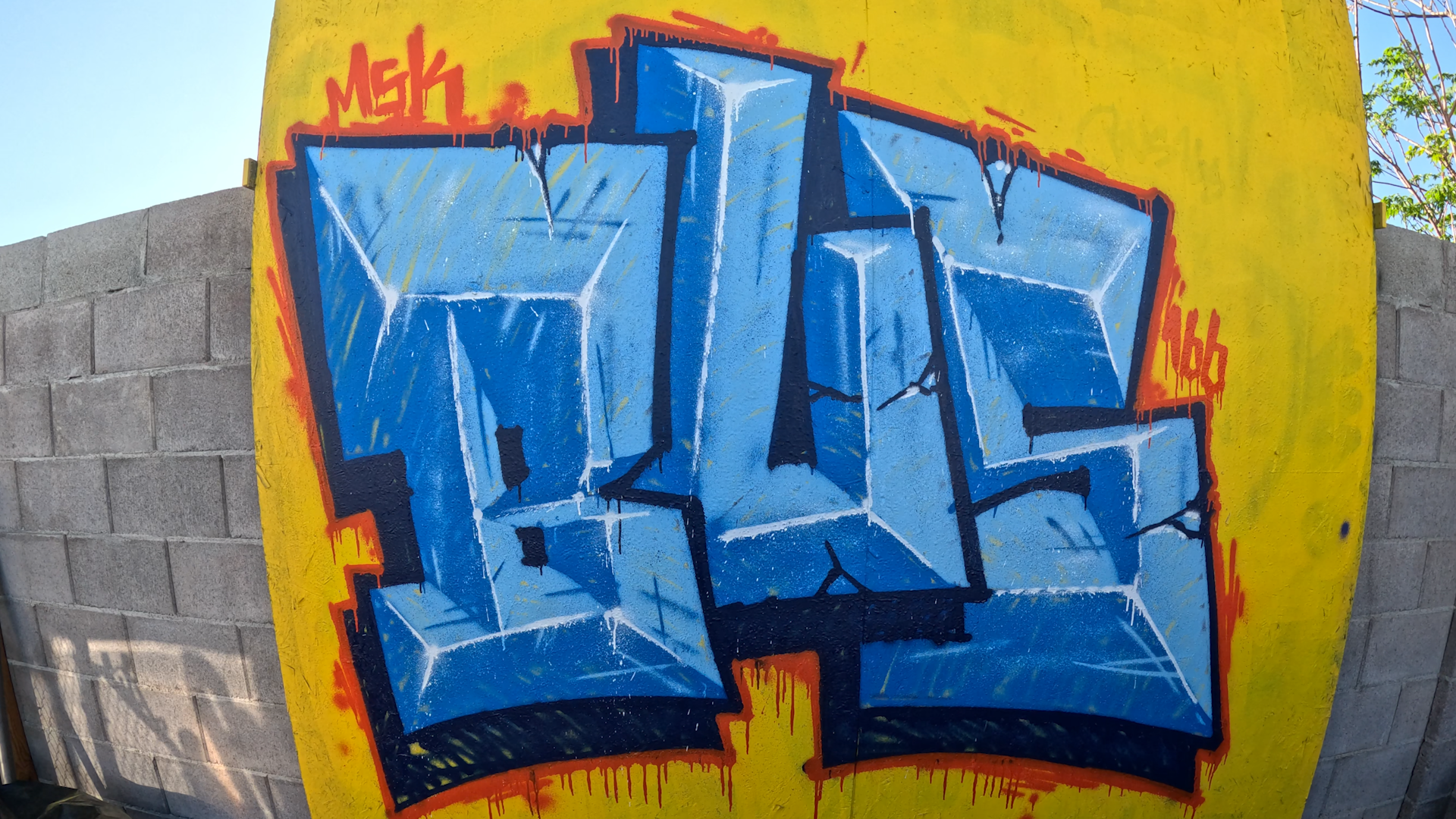
Bevel letters come down to geometry and light. Get the corners connected and the center line right, and the shape does most of the work; the highlights are what sell the dimension. This one is painted entirely with a needle cap, which is a dirty way to do bevels, but it works if that's the look you're after.
Connect All Your Corners
The rule for bevel letters is that you connect all your corners. Every corner runs to another corner, and each letter has a center line where the faces meet. Work corner to corner and let the center line establish itself as you go. Some letters produce a triangle running up to meet the center line; others give you a shape with the center running through the middle. It looks strange while you're laying it in, but the geometry resolves once the faces get shaded.
Base and Block In the Faces
With the corners connected and center lines in place, base in the letters and establish which faces are top-facing. Keeping track of face direction now matters, because every shading and highlight decision after this depends on which planes come forward and which fall back.
Should You Add Drips?
On other needle-cap videos I've done a lot of drips. On bevels I hold back, and the reason is dimensional. If a bevel really existed in space, one face comes forward toward you and the next falls back. A drip running down the letter would change direction when it crossed that edge. Once paint starts running you can't control it, so a long drip risks flattening the dimension you just built. Some drips will happen naturally, and that's fine. Intentionally adding a lot of them is worth skipping on this style.
Border first, then highlights.
Highlighting Bevels Is Different
With most graffiti you don't normally highlight inside the outline. Bevels are different. You highlight based on which planes are catching light.
Think about which parts are coming forward and which are going back. Where two faces converge going *back* into the letter, that area wouldn't catch light in real life; the front edge nearest the viewer catches the light instead, and the receding part more likely catches shadow. You don't have to paint actual shadows, but you can subtly darken those indented sections where the planes fold inward.
The center line gets a highlight along its entire length. Everywhere the center runs, it catches light. A line where two forward-facing planes meet gets a partial highlight.
Making Highlights Look Beat Up
Because this is a dirty style, keep the highlights jagged and inconsistent in thickness. The reasoning is physical: the forward-facing edges are the ones that would get beat up the most in the real world, so their highlights shouldn't be smooth and even. A dent in an edge might not catch light at all while the surfaces around it do.
I usually don't run a highlight all the way to the edge; I extend it out a little and let it fall off, since a forward-coming face would lose the light near its far side. It could go to the edge. That part is your interpretation of how the light behaves.
Run your highlights toward the corner pieces. Where three points come together, a small amount of glow in those sections works well.
Cracks, Glow, and Final Touches
When there are cracks in the letters, go in and highlight some of the crack edges. It helps them pop. Keep it as subtle as you can, which is a challenge with a needle cap since needle caps aren't especially subtle, but you can catch a little highlight on one side of a crack.
Once the highlighting is done, a small amount of white on the top-facing planes helps separate them from the other faces, since those top planes would catch more light than the ones angled away.
The needle cap works well for bevels if you're going for really dirty work.
---
Full Transcript
Okay, we're going to do some bevel letters with only the needle cap. With bevel letters, you want to connect all your corners. This connects here. This goes like this. You've got a center line here. This would connect to a corner over here. Center, come down, connect to that. So then this connects, this connects. Shape like this. This line goes in like that.
For this you're going to have a triangle that goes up here and meets the center line. So let's do the center line now. This is going to go like this. Center line here, goes about like this. Something in the middle and these like that. It's kind of strange, but you'll see.
Before we do that, let's just get this. Base this in. This would also be top-facing. Oh, crap, that's supposed to be light.
Trying to decide if I'm going to leave it like this or add extra texture. I kind of want to add some texture. I'm going to do a border first and then highlights.
On the other needle cap videos I was doing a whole lot of drips, but I'm concerned that if the drip goes too far it might ruin the dimension. Because technically, if this really existed, this comes out and this is the closest part to us, and then this goes back in. So the drip would probably change direction when it hit here. And once the paint starts dripping I can't really control that. So some drips will naturally happen and I'm fine with that. But as far as intentionally adding a whole bunch, I think I'm going to skip that for this style.
When you're highlighting bevel letters, for graffiti you don't normally highlight inside the outline, but for bevels it's a little different. You can highlight it however you want, but you have to think: there are parts coming forward and parts going back. Where two parts converge when they're going back, say right here, this wouldn't really get a highlight in real life, because this front edge is facing closer toward us and would catch the light. This would more likely catch a little shadow. We're not doing shadows here, but you could subtly darken these indentation parts, like in here, here, in between here.
All of the center line would get a highlight, everywhere in the center. This line would get a partial highlight for me, since these parts are both coming forward.
Since it's so dirty, I try to make the highlights a little jagged and inconsistent in thickness, because I want it to look like these edges, facing forward, are getting beat up the most. If there was a dent right here, it may not catch light, but the other sides would. This part I usually don't go all the way to the edge; I'll extend the highlight out a little. The way I see it, this is coming forward, so the highlight would possibly fall off. It could go all the way to the edge, but it's up to your own interpretation of what you think it would look like.
So this one heads toward this corner piece. And sometimes when three points come together I'll add a little glow on those sections. This will be a centerpiece. This starts to fall back. This would go all the way across, all the way down. Light would catch a little bit right here.
When I do have cracks, I'll go in and highlight some of the edges of the cracks. I find it helps it pop, but I try to be as subtle as possible. That's part of it; needle caps aren't really very subtle, but you might catch a little highlight on this side of the crack.
Another thing I like to do sometimes: once I'm done highlighting, I might add a little white to the top-facing parts especially, to differentiate them, because they might catch more light than this one would.
I think the needle cap works pretty well for bevels if you're going for really dirty stuff. Anyway, thank you for watching.