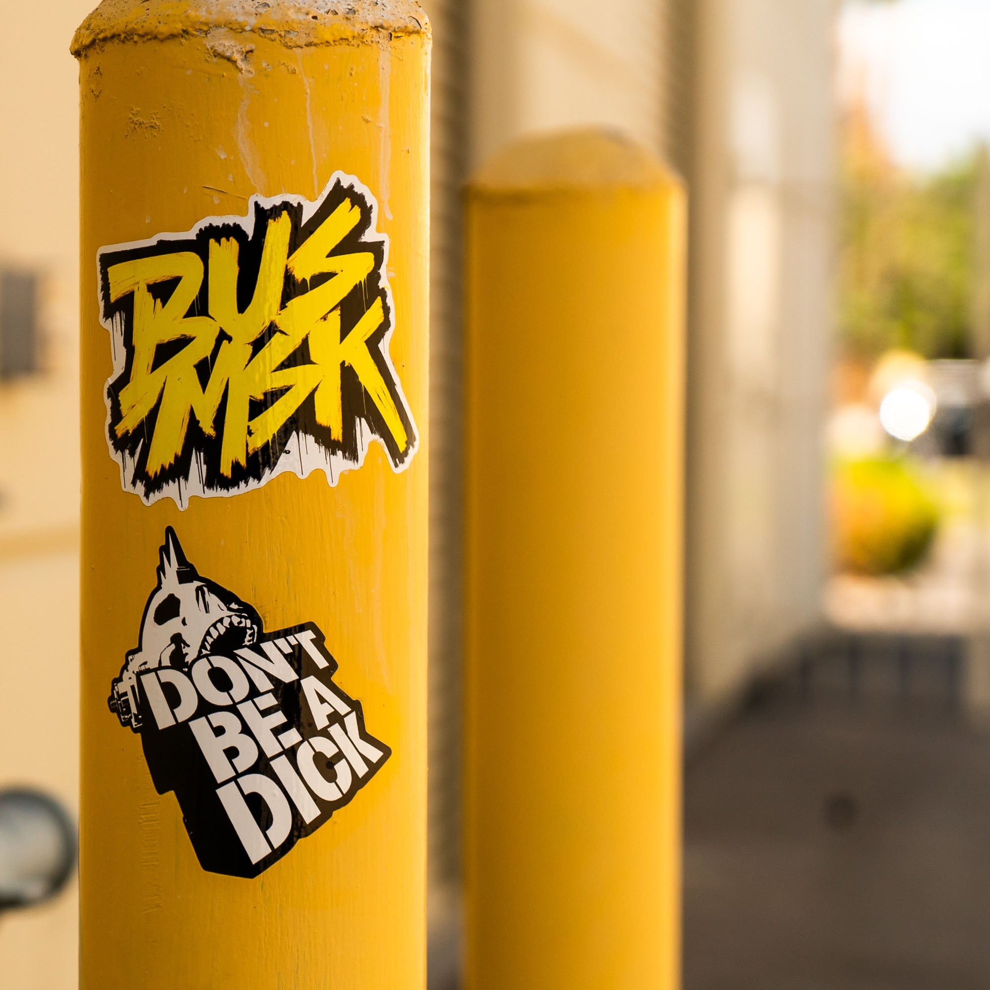
I’ve been trying to come up with some more creative ideas to use stickers and guerilla marketing tactics and started digging around to find other brands that have used stickers in their campaigns. There are a lot of creative and interesting ideas out there that I’m finding inspiring and thought I’d share them with you.
Facebook's Early "Face" Campaign
In Facebook's early days, stickers played a significant role in their marketing strategy. They used simple stickers with the word "Face" on light posts, signs, walls, and other places on Harvard's campus. This created a buzz around the campus about the new social network.
You're Beautiful Sticker Campaign
This guerrilla marketing campaign was more of a public service. An anonymous group spread small, silver stickers saying "You're Beautiful" in public places around Chicago. It quickly caught attention and made headlines, effectively spreading a positive message.
Lego's 'Brick' Campaign
Lego placed large Lego brick stickers on crosswalk buttons, parking meters, and other parts of the urban landscape to remind people of their childhood and the joy of playing with Lego.
The Simpsons Movie Campaign
For the release of The Simpsons Movie, small stickers of Homer Simpson's iconic doughnuts were placed on existing images of real donuts in various locations, such as in bakeries or grocery stores. This clever campaign used minimal resources but effectively promoted the movie in a humorous and unexpected way.
The Jealous Husband Campaign by Hell Pizza
New Zealand's Hell Pizza included small bumper stickers in their deliveries that customers could sneakily stick on the cars of friends. The bumper stickers read, "I slept with the owner of Hell Pizza and all I got was this lousy bumper sticker." The campaign quickly created buzz and became a talking point, garnering Hell Pizza a lot of attention.
'You're Beautiful' Stickers
An anonymous individual or group spread small, silver stickers saying "You're Beautiful" around Chicago. Although not necessarily a commercial campaign, it was a guerrilla effort that caught the public eye and created a lot of positive conversation.
'Andre the Giant Has a Posse'
This is an iconic street art campaign started by artist Shepard Fairey. It involved simple stickers of Andre the Giant with the accompanying text, "Has a Posse." Initially, it had no inherent meaning and was intended as an experiment in phenomenology. However, the campaign gained significant cultural relevance and became a foundation for Fairey's later work, including the famous Obama "Hope" poster.
IBM's "People for Smarter Cities"
IBM created small, colorful stickers placed on city infrastructures, such as walls, railings, and corners. These stickers represented benches, ramps, and coverings, demonstrating how simple interventions could make cities more efficient and user-friendly. It was a unique way of showcasing IBM's commitment to creating smart city solutions.
World Wildlife Fund (WWF)'s 'Save Paper' campaign
WWF placed small stickers that looked like electrical outlets in public places, but when people tried to use them, they realized the outlets were just stickers with a message about saving paper and promoting WWF's online documents.
'Mind the Gap' Campaign for Depression Awareness
As part of a campaign to raise awareness for depression and mental health, small stickers were placed near 'gaps' around cities (like gaps in benches, buildings etc.) with the message "Mind The Gap - Depression is closer than you think."
Hope some of these get your ideas going. If you need anything, or have any questions, please feel free to reach out. Thanks for taking the time to read this!

